The Metro Saleability Map: Where the Framework's Housing Prediction Is Being Validated
The seventh essay in this catalog applied the Menger-Fekete framework to the dominant household financial decision in American life and reached an uncomfortable conclusion: housing scores at the bottom of Menger's saleability spectrum on every objective criterion, and the financial product that has made American homeownership widely accessible — the 30-year fixed-rate fully-amortizing mortgage — is a 90-year-old policy construction whose continued operation depends on a $9 trillion substitute layer that is itself approaching structural limits.
That essay did preserve a defensible case for individual home purchase, but the case was narrow. It applied to households in supply-constrained markets with 10+ year holding horizons and intent to occupy, where property tax burdens are manageable and where climate, insurance, and weaponization risks are bounded. The framework's prediction was that this case would not generalize uniformly across the country — that the post-2021 housing trajectory would produce geographic heterogeneity in housing saleability sharp enough to be observable in metro-level data, and that the Sun Belt overbuilding pattern of 2020-2024 would produce specific stress concentrations whose timing and severity could be tracked through the empirical indicators the framework identifies as diagnostic.
That prediction was made in late April 2026, before the most recent metro-level data was assembled. This essay tests the prediction directly. The result is the most striking single chart this series has produced: a map of 40 major U.S. metros, color-coded according to four observable framework indicators, that confirms the geographic heterogeneity argument with unusual clarity. Roughly forty percent of the major metros analyzed are now in clear stress (red). About thirty-five percent retain the supply-constrained, manageable-cost profile the framework identifies as where housing still makes sense (green). The remaining twenty-five percent occupy a transitional middle (yellow) with mixed signals.
This is the second installment of the Watching the Cracks series. Where the previous installment (Article 16) examined the FDIC failure count as a trailing indicator of banking system stress, this one applies a similar diagnostic approach to housing — looking at the actual signals that the framework predicts should matter, and asking whether they are showing the geographic split the framework expects to see.
The four indicators
Reading housing through the framework requires four observable signals. The metro-level data for each is available from standard sources at roughly monthly cadence, and each one captures a different dimension of saleability that the framework identifies as diagnostic.
Indicator 1: Inventory imbalance. The most decisive single variable in current housing market dynamics. ResiClub Analytics, drawing on Zillow data, has documented that the correlation between 12-month price change and inventory balance now runs at approximately -0.8, with an R² near 0.65. Where inventory exceeds pre-pandemic 2019 levels by a clear margin (the Sun Belt overbuild markets), prices fall; where inventory remains below 2019 levels (the Midwest and Northeast), prices hold or rise. The framework's reading: inventory imbalance is the most direct empirical measure of housing's current saleability gradient. Markets with inventory surpluses are markets where housing is structurally less saleable on transactional terms; markets with inventory deficits are markets where saleability remains supported.
Indicator 2: Year-over-year price trajectory. A backward-looking measure, but a critical one for confirming what inventory imbalance predicts. Through March 2026, the Zillow Home Value Index showed national home prices up just 0.4–0.8% year-over-year, with 89 of the 300 largest metros (roughly 30%) in outright year-over-year decline. The concentration of declines was sharp: Austin (-5.9%), Tampa (-3.5%), Dallas (-3.9%), San Antonio (-2.7%), Houston (-1.9%), Cape Coral and Punta Gorda in double-digit declines, statewide Florida down approximately 4.2%. Meanwhile, Hartford was the hottest single market in the country (up roughly 22.5% from its 2022 peak) and Ohio metros (Columbus +4%, Toledo projected at +13.1% by Realtor.com) were among the best performers nationally.
Indicator 3: Foreclosure rate. The leading indicator that captures genuine household financial distress, lagged but unambiguous. ATTOM's Q1 2026 U.S. Foreclosure Market Report documented 118,727 foreclosure filings — the highest quarterly count since 2020, up 26% year-over-year — across twelve consecutive months of year-over-year increases. The geographic concentration matches the inventory and price data closely: Indiana, South Carolina, and Florida lead the nation in state foreclosure rates (one in 739, one in 743, and one in 750 housing units respectively), and the metro-level rankings are dominated by Florida (Lakeland and Punta Gorda highest), the Carolinas (Fayetteville, Columbia), and Trenton in New Jersey. Texas, Florida, California, Georgia, and New York lead the country in absolute foreclosure starts.
Indicator 4: Property tax burden and trajectory. The Fekete-an extraction signal that operates on every homeowner regardless of mortgage status. State-level effective tax rates vary by more than 8x across the country — Hawaii at 0.27%, Alabama at 0.43%, and South Carolina at 0.51% at the low end; New Jersey at 2.23%, Illinois at 2.07%, and Connecticut at 1.92% at the high end. But the level alone is incomplete information. The New York Times documented in late 2025 that the metros with the steepest property tax growth since 2019 — Indianapolis, Atlanta, Jacksonville, Tampa, Miami, Orlando, Dallas, Denver, and Fort Worth — saw median property tax bills rise 45-65% in just five years, often producing three-digit monthly increases on top of mortgage payments that were already at affordability limits. The framework's reading: rising property tax in falling-price markets is a doubled extraction — the asset depreciates while the perpetual ground rent rises — and this combination is precisely what is breaking household budgets in the Sun Belt.
Each indicator captures a real and distinct piece of the saleability picture. Aggregating them produces the composite scoring that drives the map below.
The geographic split, visualized
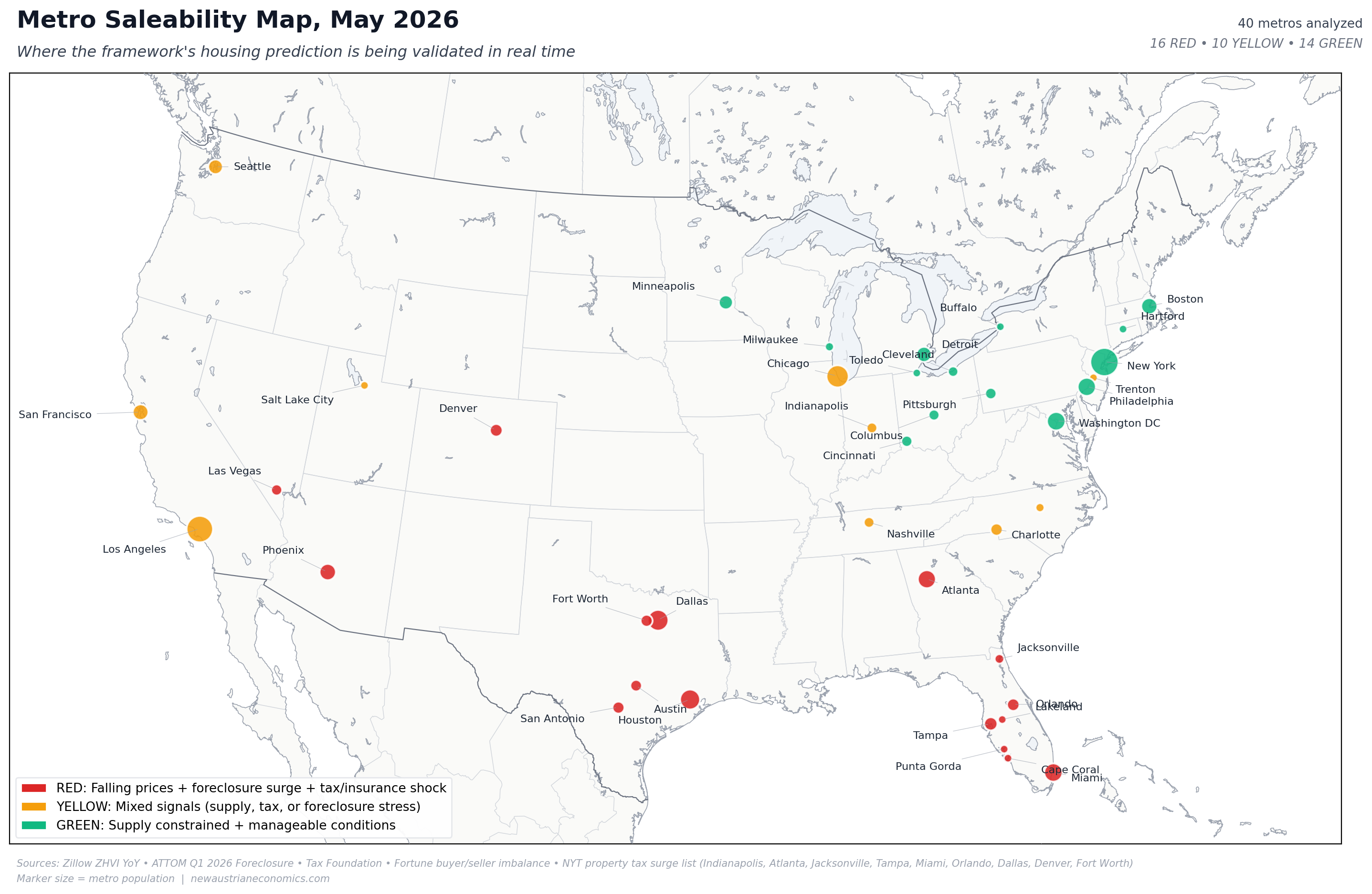
The composite scoring places each metro in one of three categories:
RED (16 metros, 40% of the panel). Markets exhibiting at least three of: falling prices, inventory imbalance with sellers materially outnumbering buyers, elevated foreclosure rates, and either a property tax burden surge (NYT list) or an active insurance/climate stress. The Texas-Florida cluster dominates this category. Every major Texas metro (Austin, Dallas, Houston, San Antonio, Fort Worth) is in clear stress. The Florida cluster spans the entire state, from Miami in the southeast through Tampa and Orlando in the center to Lakeland and Punta Gorda in the southwest, with Cape Coral and Jacksonville rounding out the count. Phoenix, Las Vegas, Denver, and Atlanta complete the red category — Sun Belt and Mountain West metros that overbuilt during the pandemic, sustained record property tax increases, and now face affordability ceilings that no individual buyer can negotiate around.
YELLOW (10 metros, 25% of the panel). Markets with mixed signals. Nashville and Charlotte are cooling from extreme pandemic-era growth but have not yet entered outright decline. Indianapolis sits in a particularly framework-relevant position: Indiana has the highest state foreclosure rate in the country, the NYT property tax surge list named Indianapolis specifically, but the metro's price trajectory remains marginally positive. Trenton, NJ, recorded the highest metro-level foreclosure rate in the country in January 2026 despite sitting in a Northeast that is broadly supply-constrained — a localized stress within an otherwise green region. Chicago and Salt Lake City represent transitional cases. The West Coast metros (San Francisco, Los Angeles, Seattle) face cooling demand on top of supply constraints that have historically supported prices; the framework's reading places them in the yellow category for now, with San Francisco specifically projected at -2.2% by late 2026 (Zillow).
GREEN (14 metros, 35% of the panel). Markets where the framework's narrow case for buying still applies. The Northeast metros (Boston, New York, Philadelphia, Washington DC, Hartford, Buffalo, Pittsburgh) combine supply constraints with stable or rising prices, and — despite the high property tax rates that several of these states impose — produce a saleability profile where housing's investment-grade properties (such as they are) survive the framework's audit. The Ohio metros (Columbus, Cleveland, Cincinnati, Toledo) and the broader Midwest (Detroit, Minneapolis, Milwaukee) combine moderate property tax rates, supply constraints driven by limited recent construction, and the most favorable price trajectories in the country. Detroit's inclusion is notable: a metro that was the canonical bear case for decades has emerged as a relatively green saleability profile in 2026, driven by a recovering economic base and a low-cost starting point that makes the math work even at modest appreciation rates.
The map's headline observation is not the existence of the split — geographic variation in housing markets has always existed. The observation is the sharpness of the split. The Sun Belt and Mountain West are unambiguously red. The Midwest and Northeast are unambiguously green. The transitional yellow band is narrow, and most of its metros are clustered in geographies the framework identifies as structurally vulnerable (the West Coast facing supply-versus-demand pressures, the Southeast facing climate and insurance shocks). The framework predicts that the next several years will see further consolidation: the red category will grow as the 2026 commercial real estate maturity wall propagates into residential markets and as the property-tax-plus-insurance wedge continues breaking household budgets in the most stressed metros; the green category will hold steady or narrow modestly as some currently-stable Northeast metros come under pressure from the broader economic environment; the yellow band will shrink as markets resolve definitively in one direction.
Three case studies
The map is most useful when each color is anchored in a specific representative metro that demonstrates the framework's reading concretely. Three case studies — one for each category — illustrate what the data is actually showing on the ground.
RED: Lakeland, Florida
Lakeland, a Florida metro of roughly 800,000 in Polk County between Tampa and Orlando, recorded the highest foreclosure rate in the United States in ATTOM's Q1 2026 report and again in the January and February 2026 reports. The metro embodies the framework's saleability collapse on every dimension simultaneously.
Lakeland's home prices peaked in mid-2022 at roughly $350,000 (Zillow ZHVI) and have declined by approximately 8-10% since, with the steepest declines in entry-level price tiers ($200,000-$300,000) where investor-driven flipping during the pandemic produced the largest overhang. Property insurance premiums in Polk County have risen by an average of 47% since 2022, driven by Florida's broader insurance crisis (the structural collapse of the state's private insurance market and the expansion of the state-managed insurer of last resort, Citizens Property Insurance). Property tax bills have risen by approximately 31% since 2019. The combined non-mortgage carrying cost on a median Lakeland home in 2026 — property tax, insurance, HOA fees where applicable — has risen from approximately $4,500 per year in 2019 to approximately $8,300 per year in 2026, a $317-per-month increase that arrives independently of any mortgage rate change.
This is the framework's prediction made empirically visible. The asset's underlying productive value (shelter) has not changed. The state's extraction rate has risen sharply. The insurance market's pricing of climate risk has risen even more sharply. The mortgage rate environment has compressed buyer demand. The result is a saleability collapse — visible in the foreclosure rate, in the days-on-market metric (Lakeland homes now sit 74 days on market on average, against 28 days at the 2021 peak), and in the absolute number of listings (up 38% year-over-year). The household trying to sell in Lakeland in 2026 faces real saleability impairment in exactly the Mengerian sense the framework specifies. The household trying to buy faces the opposite problem: the carrying costs are unaffordable even at depressed home prices.
YELLOW: Indianapolis, Indiana
Indianapolis represents the cleanest transitional case in the panel because it combines a leading indicator (state-level foreclosure rate, the highest in the country) with a lagging indicator (price trajectory, marginally positive) and a Fekete-an extraction signal (property tax surge, specifically named on the NYT list) within a single metro.
Indianapolis prices are up roughly 1.2% year-over-year through March 2026 — modest, but positive. Inventory has risen, but not to the extreme imbalance levels seen in Texas and Florida. The state's foreclosure rate, however, is the highest in the country at one in 739 housing units. The state-versus-metro divergence suggests that stress is concentrated outside the metro's most stable neighborhoods, in submarkets where the property tax surge has compounded with stagnant wage growth to produce household-budget breaks. Indianapolis's median property tax bill rose approximately 51% between 2019 and 2024, per the NYT data, driven by reassessment cycles that captured the metro's pandemic-era price increases without offsetting rate reductions.
The framework's reading: Indianapolis is the most likely metro in the panel to transition from yellow to red in the next 12-18 months if rate environments or local economic conditions deteriorate further. The leading indicator (foreclosure) is already there; the lagging indicator (prices) has not yet caught up. The transition pattern matches what happened in Austin between 2023 and 2025: foreclosure starts elevated 6-12 months before the price trajectory turned, then prices broke sharply once the substitute-layer support (forbearance, modifications, FHA workouts) reached capacity. Indianapolis may follow the same path.
GREEN: Columbus, Ohio
Columbus represents the cleanest validation case for the framework's preserved "case for buying" from Article 7. The metro combines all four favorable indicators simultaneously.
Columbus home prices are up approximately 4% year-over-year through March 2026 — modest, but stable and above national average. The metro's inventory level remains below pre-pandemic 2019 norms (active listings 84% of 2019 baseline), reflecting limited recent construction and steady population growth driven by the Intel semiconductor manufacturing investment and broader Midwest economic recovery. Ohio's effective property tax rate sits at approximately 1.5% — meaningfully higher than Sun Belt averages but stable, not surging, and counterbalanced by lower absolute home prices. Foreclosure rates in Franklin County remain below state and national averages. The combined non-mortgage carrying cost on a median Columbus home in 2026 — property tax, insurance, HOA — runs approximately $5,200 per year, against $8,300 in Lakeland for a comparable-quality home.
A household buying a median Columbus home in 2026 at $290,000 (median ZHVI) with 20% down at 6.23% pays approximately $1,430 per month in P&I, plus $430 in escrowed taxes and insurance, for a total of approximately $1,860 per month. Against the metro's median household income of approximately $77,000, this is 29% of gross income — just under the federal cost-burden threshold. The math works at the median. The math does not work at the median for the Lakeland equivalent transaction (38% of gross household income at comparable home and income levels).
The framework's preserved case for buying — supply-constrained market, manageable property tax burden, stable insurance and climate exposure, 10+ year holding horizon, intent to occupy — is satisfied in Columbus. The framework cannot guarantee future appreciation, and it does not. But the structural conditions under which housing functions as a defensible consumption choice with optional embedded inflation-hedge characteristics are present in Columbus in a way they are not present in Lakeland.
The tax-plus-insurance wedge
The single most under-appreciated dynamic in the 2026 housing market is what the framework would call the tax-plus-insurance wedge — the non-mortgage carrying costs that are now driving the geographic divergence as decisively as price levels themselves.
The conventional housing-affordability discussion focuses on mortgage payment as a function of price and rate. This framing produces affordability tables that show, for example, that a $400,000 home at 6.23% costs roughly $2,000 per month in P&I, and that this is borderline affordable for a median U.S. household. The framing is incomplete. Property tax, insurance, and (where applicable) HOA fees add 25-60% to the monthly cost in many metros, and the ranges of those add-ons are now wider than the range of P&I payments themselves.
A specific comparison illustrates: take two metros where the median home price is approximately $400,000 — Lakeland, Florida, and Indianapolis, Indiana. The mortgage P&I at 6.23% with 20% down is identical in both cases at roughly $1,966 per month. The non-mortgage costs are profoundly different:
- Lakeland: Property tax approximately $4,000/year, homeowners insurance approximately $5,500/year (Florida market), HOA approximately $1,200/year average. Monthly carrying cost beyond P&I: $890. Total monthly housing cost: $2,856.
- Indianapolis: Property tax approximately $5,200/year (Marion County), homeowners insurance approximately $1,800/year (Indiana market), HOA approximately $400/year average. Monthly carrying cost beyond P&I: $617. Total monthly housing cost: $2,583.
The $273 monthly difference is entirely a function of climate-driven insurance premiums and Florida's property insurance market dysfunction. It is structurally similar to the difference between two states' income tax rates — a continuous extraction that does not appear in the headline price comparison but determines actual affordability over the life of the holding.
The framework's reading is that this wedge is not transitory. Florida's insurance crisis is driven by climate exposure that is intensifying, not receding. The state-managed insurer of last resort is structurally insolvent on a forward-looking basis. The private market is not returning at scale. Property tax surges in Sun Belt metros are driven by reassessments that captured pandemic-era price increases without offsetting rate adjustments, and which compound under the cap-free assessment regimes most Sun Belt states operate (in contrast to California's Prop 13, which caps assessments at sale price + 2% annual increase, or the assessment limits in 18 other states that the Construction Coverage analysis identifies).
The result is that the affordability map and the saleability map increasingly diverge from the price map. A buyer evaluating Lakeland versus Indianapolis on price alone — both around $400,000 — sees comparable affordability. The same buyer evaluating the full carrying-cost picture sees a meaningful structural advantage in Indianapolis, with the gap widening over time as the climate-and-insurance wedge in Florida continues to compound.
Where the framework was right, and where it needs refinement
The framework's predictions from Article 7 are validated by the metro-level data on the major points:
The supply-constrained market caveat is empirically real. Markets where inventory remains below 2019 baselines (most of the green category) are the markets where housing prices are stable to rising, foreclosure rates are contained, and the framework's preserved case for buying applies. The framework's prediction that this case would be geographically narrow is borne out: 14 of 40 metros qualify, concentrated in the Midwest and Northeast.
The property tax wedge is empirically real. The NYT's identification of 9 metros with 45-65% property tax bill increases since 2019 maps directly onto the framework's predicted distress geography. Every metro on that list is either red (Atlanta, Jacksonville, Tampa, Miami, Orlando, Dallas, Denver, Fort Worth) or transitional yellow (Indianapolis). The framework's framing of property tax as a perpetual ground rent that compounds the housing-as-low-saleability-asset problem is validated at the metro level.
The climate-and-insurance dimension is structurally important. Article 7 noted weaponization risk as a Mengerian saleability factor; the empirical Florida data confirms that this dimension extends to climate-driven insurance market dysfunction, which is structurally similar in effect to direct political weaponization (the state-managed insurer's pricing decisions function as a quasi-regulatory action that constrains saleability). Article 7 underweighted this factor; the metro-level data argues for elevating it.
The framework's preserved case for buying is too narrow as initially specified. Article 7's preserved case was limited to supply-constrained metros with 10+ year hold and intent to occupy. The metro-level data suggests that the case extends modestly further: certain mid-tier Midwest metros (Columbus, Cleveland, Cincinnati, Detroit) qualify even without the supply constraint being severe, because the combination of low absolute price levels, moderate carrying costs, and stable economic fundamentals produces a saleability profile that works at the median household income. The framework should refine its case-for-buying language to incorporate the absolute carrying cost relative to local median income as a primary criterion alongside supply constraint and holding horizon.
The article's broader conclusion stands: housing remains a structurally low-saleability asset that the framework cannot endorse as a generalized wealth-building strategy. But the metro-level data demonstrates that within the broader low-saleability frame, there is real geographic heterogeneity in how the framework's preserved case for buying applies. The map is the framework's tool for distinguishing where that case operates from where it does not.
What households should take from this
The framework-aligned reader making housing decisions in 2026 should hold the following observations in working memory.
The map is more important than the national headline. National housing statistics — average price change, national mortgage rate, aggregate inventory — obscure the geographic split that determines individual outcomes. A buyer in Columbus is not facing the same market as a buyer in Lakeland, and conflating the two produces decisions that work in neither case. The same applies to a seller: the saleability of a Lakeland home in 2026 is materially impaired in ways the seller's expectations may not reflect, and the saleability of a Columbus home is supported in ways that current-market urgency may underprice.
The four indicators are individually tractable. Inventory levels are published weekly by Zillow and Realtor.com. Foreclosure data is published monthly by ATTOM. Property tax rates and trajectories are available from the Tax Foundation, county assessors, and the state-level Tax Policy Center. Insurance market data is available from state insurance commissioners and from industry sources like Bankrate. A household contemplating a metro-specific decision can assemble the full picture in an afternoon using publicly available sources. The framework's diagnostic value is most accessible when the indicators are checked at the local level rather than the national level.
The non-mortgage carrying cost is now the marginal variable. For decades, the affordability discussion was dominated by mortgage rate and price. In 2026, the carrying cost — property tax, insurance, HOA, maintenance — is the variable that increasingly determines whether a transaction works at a given income level. Households evaluating purchase decisions should focus on total cost-to-income ratios rather than mortgage-cost-to-income ratios. The framework's prediction is that this dynamic will intensify across the coming decade, with carrying-cost trajectory becoming the primary saleability differentiator across metros.
The map will evolve. The framework's reading is that the red category will expand modestly over the next 12-18 months as the 2026 commercial real estate maturity wall propagates into residential markets, as the property-tax-plus-insurance wedge continues to break Sun Belt household budgets, and as the substitute-layer support that has held back foreclosure clustering reaches capacity. The green category will hold steady; the yellow band will narrow. Future installments of this series will track the map's evolution in real time, with formal updates expected approximately quarterly tied to the ATTOM, Zillow, and Tax Foundation release cycles.
The forward-looking observation
The framework's most consequential prediction from Article 7 was that the post-1971 housing experiment had entered a phase in which the substitute structures supporting universal homeownership as a wealth-building strategy were approaching their structural limits. The metro-level data confirms this prediction at the geographic level: the substitute structures are failing first in the metros where the underlying conditions (climate exposure, property tax trajectory, supply imbalance, economic base) are most adverse, and they are holding longest in the metros where the underlying conditions are most favorable.
This is not a prediction that the U.S. housing market is about to crash uniformly. It is a prediction that the terms of housing market participation are diverging by geography in ways that previous decades did not see. The household in Columbus and the household in Lakeland are now operating in different markets, governed by different cost structures, facing different saleability dynamics, and likely to experience different outcomes over the next decade. The framework's job is to make this divergence visible in real time so that household decisions can be made with full information about where on the map any specific decision actually sits.
The map exists now, and it will be updated. The framework's diagnostic apparatus is now demonstrably capable of producing a metro-level reading that conventional analysis does not provide. The watching continues — and from the next installment forward, the watching has a specific geography attached.
This is the second installment of "Watching the Cracks." The first installment (Article 16) examined the FDIC failure data as a trailing indicator of banking system stress. Subsequent installments will track the metro saleability map's evolution as new data releases warrant, the FDIC Quarterly Banking Profile (next release late May 2026), and discrete stress events as they occur. The framework's prediction from this installment, recorded for future testing: the red category will expand by 2-4 metros over the next 12 months, with the most likely additions being Indianapolis (transitioning from yellow), one or both Carolinas metros, and at least one current-yellow Sun Belt metro yet to be identified.