The Metro Saleability Map
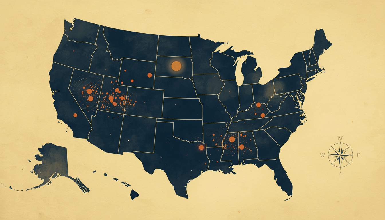
National housing statistics obscure the only variable that now matters. Through Q1 2026, 89 of the 300 largest U.S. metros are in outright year-over-year price decline while Hartford is up 22.5% from its 2022 peak and Toledo is projected at +13%. Lakeland, Florida runs the highest foreclosure rate in the country; Columbus, Ohio runs the cleanest framework-validated case for buying. The geographic split is real, sharp, and worsening — and the framework's housing prediction from Forum #7 is being validated against forty metros, four indicators, and one US map.
Full analysis: newaustrianeconomics.com/forum/17-metro-saleability-map
Welcome to Issue #004 of The Dispatch. Each Monday, this letter takes one situation from the week's news and reads it through the lens of Carl Menger and Antal Fekete — paired with a foundational concept and a piece from the archive. If someone forwarded this to you, subscribe here.
The Lens
The national housing statistics for early 2026 read like ordinary cooling. The Zillow Home Value Index is up 0.4–0.8% year-over-year. Mortgage rates are stable around 6.23%. Existing home sales are down modestly. Aggregate inventory is up.
The aggregate hides the only variable that now matters.
Through March 2026, 89 of the 300 largest U.S. metros are in outright year-over-year price decline — roughly thirty percent of the market. Austin is down 5.9%. Tampa is down 3.5%. Dallas is down 3.9%. Cape Coral and Punta Gorda are in double-digit declines. Statewide Florida is off approximately 4.2%. Meanwhile Hartford is the hottest single market in the country at 22.5% above its 2022 peak, and Realtor.com projects Toledo at +13.1% by year-end. Lakeland, Florida recorded the highest foreclosure rate in the United States in ATTOM's Q1 2026 report, and again in January, and again in February. Indiana, South Carolina, and Florida lead the nation in state foreclosure rates. The conventional housing-affordability discussion focuses on mortgage rate and price. The variable that now determines whether the math works is something else entirely.
Lead Essay: Forty Metros, Three Colors, One Map
Forum essay #7 made an uncomfortable prediction in late April: housing scores at the bottom of Menger's saleability spectrum on every objective criterion, the preserved case for individual home purchase is narrow (supply-constrained markets, 10+ year holding horizon, intent to occupy, manageable carrying costs), and the post-2021 trajectory would produce geographic heterogeneity in housing saleability sharp enough to be observable in metro-level data.
The new installment tests that prediction against forty major U.S. metros, four observable indicators, and one composite map. The result is the most striking single chart this catalog has produced. Roughly forty percent of the major metros are now in clear stress (red). About thirty-five percent retain the supply-constrained, manageable-cost profile the framework identifies as the preserved case for buying (green). The remaining twenty-five percent occupy a transitional middle (yellow). The split is real and sharp.
The four indicators are individually tractable and reported at roughly monthly cadence. Inventory imbalance (the correlation between 12-month price change and inventory balance now runs at -0.8 per ResiClub Analytics — the single most decisive variable). Year-over-year price trajectory (Zillow's metro-level ZHVI). Foreclosure rate (ATTOM's quarterly market report, with January 2026 documenting 118,727 filings — the highest quarterly count since 2020, the twelfth consecutive month of year-over-year increases). Property tax burden and trajectory (the NYT documented 9 metros with property tax bills up 45–65% in just five years since 2019).
Three case studies anchor the categories. Lakeland, Florida (RED) embodies saleability collapse on every dimension simultaneously: prices off 8–10% from the 2022 peak, days-on-market at 74 (up from 28 at the pandemic peak), inventory up 38% year-over-year, foreclosure rate the highest in the country, and a combined non-mortgage carrying cost that has risen from $4,500 per year in 2019 to $8,300 in 2026 — a $317-per-month increase that arrives independently of any mortgage rate change. Indianapolis, Indiana (YELLOW) is the cleanest transitional case: leading indicator already in stress (state-highest foreclosure rate), lagging indicator not yet there (prices marginally positive), property tax surge specifically named on the NYT list. The framework predicts Indianapolis as the metro most likely to cross from yellow to red within 12–18 months, following the pattern Austin established between 2023 and 2025. Columbus, Ohio (GREEN) is the cleanest validation: prices up 4% year-over-year, inventory at 84% of the 2019 baseline, moderate property tax, low insurance premiums, and a combined carrying cost roughly $3,100 per year less than the Lakeland equivalent on a comparable home. A median-income Columbus household buying at the median ZHVI runs 29% of gross income on total housing cost; the same household in Lakeland runs 38%. The math works at the median in one metro and not in the other.
The tax-plus-insurance wedge is the most under-appreciated dynamic in the 2026 market. Take two metros where the median home price is approximately $400,000 — Lakeland and Indianapolis. Mortgage P&I is identical at $1,966 per month. Lakeland total carrying cost: $2,856. Indianapolis: $2,583. The $273 monthly difference is entirely a function of Florida's insurance market dysfunction and Sun Belt property tax surges, both of which are structurally compounding rather than transitory. Florida's state-managed insurer of last resort is structurally insolvent on a forward-looking basis. The private insurance market is not returning at scale. Property tax surges in Sun Belt metros are driven by reassessments that captured pandemic-era price gains without offsetting rate adjustments, under cap-free assessment regimes (in contrast to California's Prop 13 and the assessment limits in 18 other states). The wedge compounds.
The framework's prediction, recorded for testing: the red category will expand by 2–4 metros over the next 12 months, with the most likely additions being Indianapolis (transitioning from yellow), one or both Carolinas metros, and at least one current-yellow Sun Belt metro yet to be identified. The green category will hold steady; the yellow band will narrow. Future installments will update the map quarterly tied to the ATTOM, Zillow, and Tax Foundation release cycles.
→ Read the full analysis: The Metro Saleability Map — The Forum
Concept in Focus: Mengerian Saleability
Carl Menger's 1892 essay On the Origin of Money established the framework's foundational concept: goods exist on a spectrum of saleability — the ease with which they can be exchanged for other goods on terms approximating their actual value, across varying quantities, across time, in varying conditions. The most saleable good in a community becomes money through unplanned market evolution; lower-saleability goods circulate at increasing discounts as the conditions of exchange deteriorate.
Saleability is not an intrinsic property of a good. It is a property of the good relative to its market conditions. Gold is highly saleable in 2026 because there is deep global demand for it, a thick clearing infrastructure, and no operational impediment to converting it into other monetary forms on demand. The same gold would be far less saleable in a market with thin demand, an impaired clearing infrastructure, or operational constraints on conversion. The framework's value is in identifying which conditions are doing the work and how they change.
Housing's saleability is structurally low. Audited against the six Mengerian criteria, it scores poorly on transportability, divisibility, homogeneity, and immediate marketability; only on durability does it score well. The 30-year fixed-rate fully-amortizing mortgage is a substitute structure that has made housing transactable as if it were a higher-saleability asset, but the substitute structure is itself a 90-year-old policy construction whose continued operation depends on a $9 trillion paper substitute layer (agency MBS) now approaching its limits.
The metro saleability map applies Menger's framework at the geographic resolution where individual household decisions actually operate. Aggregate housing statistics describe an abstraction; the household buys or sells in a specific metro under specific local conditions. The four indicators in the map are the operational signals that the framework's saleability concept predicts should matter most. The map's color-coding is the framework's reading of which combinations of those signals produce saleability profiles where housing's preserved case for buying applies versus where it does not.
The Atlas page on the Origin of Money walks through Menger's saleability framework in full.
The Actionable
The map's diagnostic value translates into specific operational steps for household readers.
- Check your own metro on the four indicators. Inventory levels are published weekly by Zillow and Realtor.com. Foreclosure data is published monthly by ATTOM. Property tax rates and trajectories are available from the Tax Foundation, county assessors, and state-level Tax Policy Center. Insurance market data is available from state insurance commissioners. A household contemplating a metro-specific decision can assemble the full picture in an afternoon.
- Use total carrying cost-to-income, not mortgage cost-to-income. The non-mortgage carrying cost (property tax, insurance, HOA, maintenance) is now the marginal variable that determines whether a transaction works at a given income level. For Sun Belt metros, this can add 25–60% to the headline mortgage cost. Households evaluating purchase decisions in red-category metros should price the carrying-cost trajectory explicitly — not just the level today.
- Don't aggregate. A buyer in Columbus is not facing the same market as a buyer in Lakeland. National housing statistics — average price change, national mortgage rate, aggregate inventory — obscure the geographic split. The same applies to sellers: the saleability of a Lakeland home in 2026 is materially impaired in ways the seller's expectations may not reflect; the saleability of a Columbus home is supported in ways that current-market urgency may underprice.
- The map will evolve. Quarterly updates tied to ATTOM, Zillow, and Tax Foundation release cycles. The framework's prediction is that the red category will expand modestly over the next 12–18 months. Future Watching the Cracks installments will track it.
Educational content only — not investment advice.
From the Archive
"In recent years through QE (Quantitative Easing) and ZIRP (Zero Interest Rate Policy) the Fed has succeeded in bankrupting the entire insurance industry. Through a peculiar ignorance of mathematics (in which it is supposed to be eminently strong) the industry has failed to take notice of the capital destruction to which it has fallen victim."
— Antal Fekete, How the Fed Bankrupted the Insurance Industry (November 2014)
Fekete's 2014 essay argued that sustained suppression of interest rates by the central bank does not merely lower returns on insurance company portfolios — it structurally destroys the capital efficiency of any business whose model requires positive real interest rates to fund long-dated obligations. The mechanism he described is the upstream cause of what the household in Polk County now experiences as a 47% rise in property insurance premiums since 2022 and the structural exit of private insurers from the Florida market. The Florida insurance crisis is not a climate story being told as a financial story. It is a financial story whose climate dimension makes visible what twelve years of distorted interest rate structure had already broken in the underwriting math.
→ Read the full essay in the Fekete Archive
Also This Week
- Companion piece (single-metro deep dive): Lakeland, Florida: How One Sun Belt Metro Became the Saleability Collapse Case Study — the human-scale narrative behind the data, with Bob Miller's 2008-to-2026 perspective and the reproducible Sun Belt pattern that should be expected at characteristic lags in Cape Coral, Punta Gorda, Tampa, Orlando, and Jacksonville.
- Structural companion: The Tax-Plus-Insurance Wedge: How Non-Mortgage Carrying Costs Became the Marginal Variable in American Housing — generalizes the wedge concept introduced in this issue's lead essay. The most direct prescriptive guidance the catalog has yet published on household housing decisions.
- Atlas: The Origin of Money — Menger's saleability framework, the foundation underneath the map.